Testing the Future of Self-Archiving
Today we’re treated to a post by Leila Sterman, our partner at Montana State, on using user testing to build Shareyourpaper.org. If you don’t know shareyourpaper.org, first check out the website and our earlier blogs, as we’ll focus on sharing our progress today.
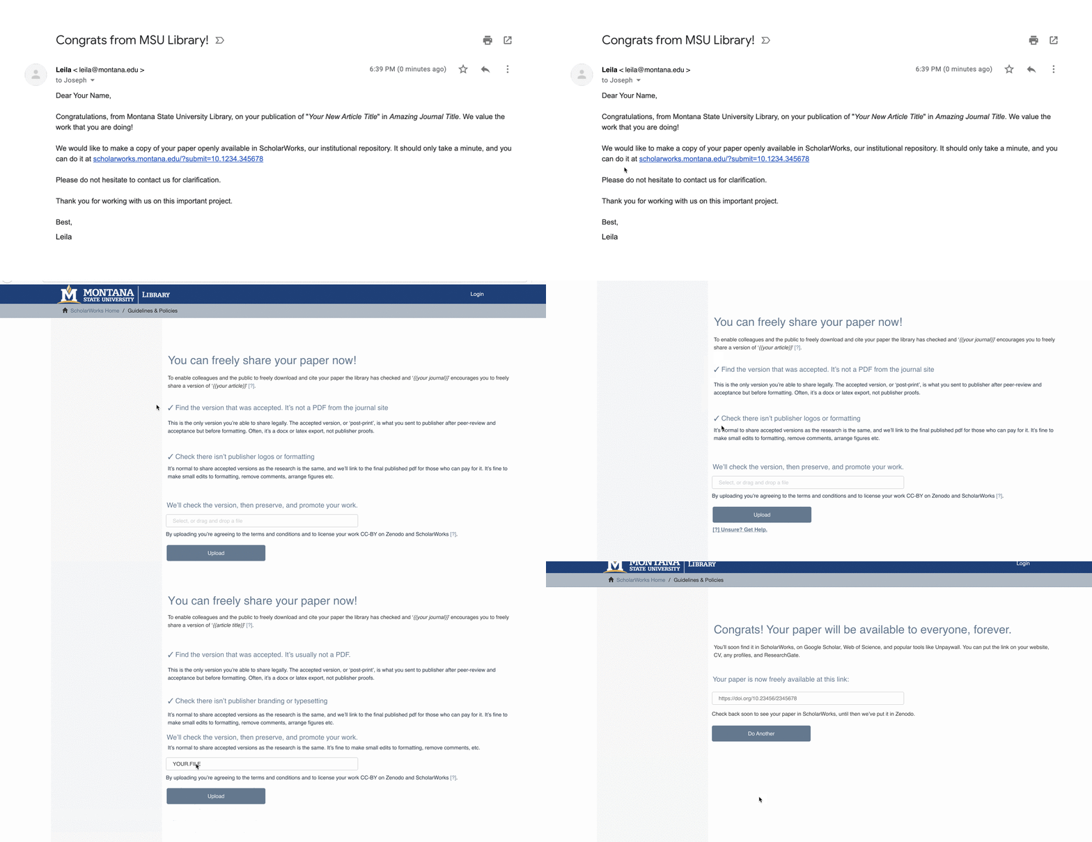
Self-archiving has a reputation for causing confusion. With shareyourpaper.org, we are working to streamline the process, since, like anyone who has ever had to explain the difference between publisher’s proofs and preprints knows, that reputation for confusion is well-earned. Upsetting that reputation requires mechanizing as much of the process as possible. It also requires user testing. I want to share some of what we’re learning from user testing, and shareyourpaper.org’s all-new workflows for your feedback.

User testing is the act of observing real users in order to identify issues. For us, this means putting our prototypes in front of users, asking them to try to self-archive something, and watching closely. As we see and understand issues coming up again and again, we can often make changes in real-time from “behind the curtain.” This delights not only testers who see their suggestions appear as they watch, but also us, as we are likely to never see the issue again. User testing is also, somewhat, a way of life that puts the user first. Before we built a single line of code for shareyourpaper.org, we’d undergone 15 major revisions of workflow, copy, and design aimed at building a simple-to-use tool with our values baked in. While often that means what we build isn’t what we expected, it also means that we know it works.
Shareyourpaper.org is built to take advantage of everything libraries learned from doing mediated deposit. We think the magic that makes scholarly communications professions successful (a cheerful demeanor, concision, persistence, and a willingness to explain things a few times) is pretty close to the magic that gets authors through a webpage to deposit postprints. One of the first steps was to try to condense the complicated vocabulary of mediated deposit into friendly, conversational text. Armed with the knowledge that people rarely read much more than a line or two of directions, our task was to communicate just enough to enable correct actions, without getting folks mired in the details. This can be difficult, since, as librarians, we are trained to love the details. In practice, it does not matter if authors understand the details of the permission checking system, only that they are legally allowed to post a specific version. And we have the details tucked in, so that the curious author may investigate further and learn about the process.
We’ve learned a lot from user testing, no part of the system has remained untouched. So far, a lot of the user testing has attempted to assess the level of chatty language that conveys the right message, without confusing users. We think we’re getting there, as users feel supported throughout, compliment the efficiency of the text, and know what they’re doing. While the temptation to explain more is strong, we’re taking solace in the fact that this method helps people get archiving right and helps them do it quickly.

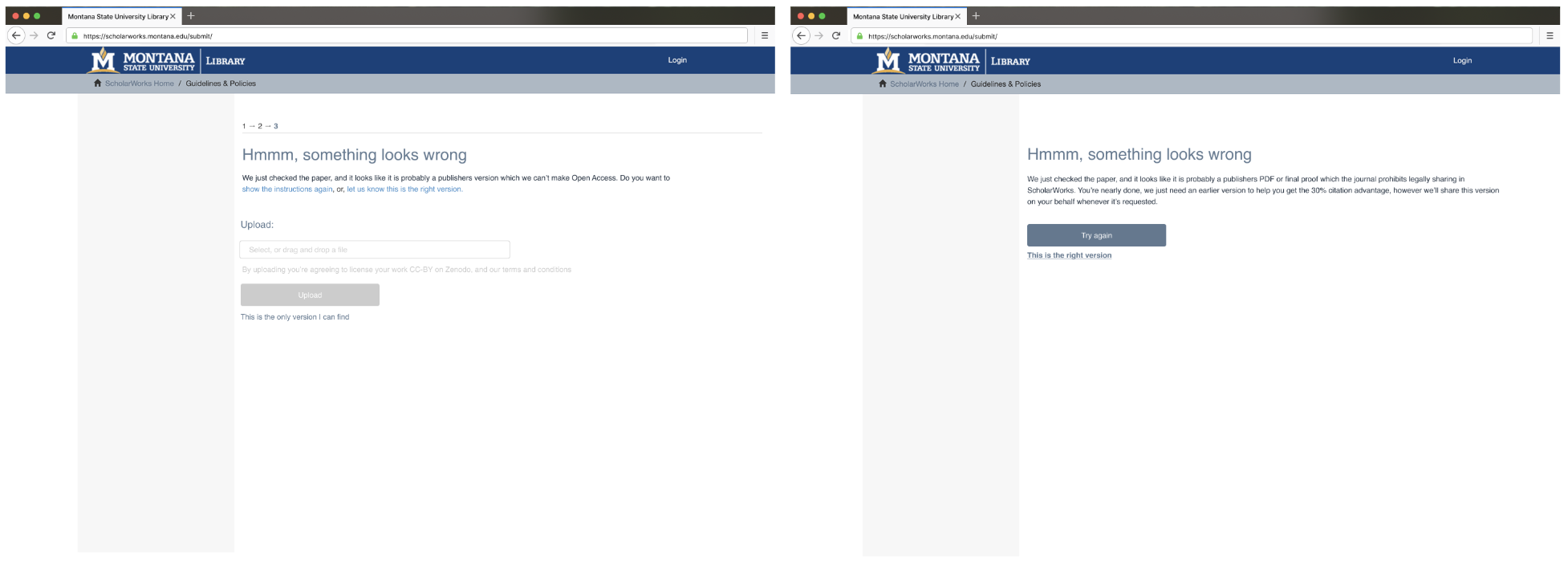
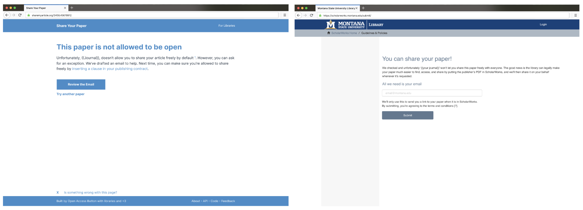
While we aim to help things go right the first time, the reality is that sometimes they don’t. Sometimes, authors aren’t allowed to make a paper open access, aren’t paying close attention and upload wrong copy, or don’t have the right copy. While testing these scenarios, we focused on ensuring that, if any of these things happen, uploaders can’t fail and can even walk away feeling good. This is where we’ve made the biggest changes vs earlier designs.
For example, shareyourpaper.org will detect when authors upload the wrong copy and help authors identify and find the right copy. Initially, we presented five options at this stage: we thought they were clear and simple, yet nuanced enough to cover every possible issue. Users showed us that they were neither clear nor simple. As a result, they felt lost and gave up on the whole process. This meant that they lost all progress and left confused. Not great. After several redesigns (many ending with similar results), we did get to two familiar and simple options that authors understood and made sure that, if they left, we could still make their work more accessible. Finally, the page reliably got people to a productive outcome, even if they never found their Postprint — success!

It has been our aim to test this tool with a broad range of authors at Montana State, from doctoral students working on their first publication to high-publishing repository champions, as well as the library staff that support them. We gained valuable insights from our local authors but there is more to learn. We’ll keep testing, and invite you to check out the designs and share your feedback.
We’re excited to be the first to use Shareyourpaper.org, we don’t want to be last! We’re hoping to have a version anyone can set up in 30 minutes early next year, so to get early access please sign up here.
Thanks to the Arcadia Fund for their generous support of the Open Access Button’s work and shareyourpaper.org

